- Features
- Tools
QI tools are seamlessly integrated, providing an easy to use platform, tailored to running QI projects.
- Community
Bring your people together to share ideas, accelerate learning and drive change - anytime, anywhere.
- Reporting
Track outcomes and analyze progress across your team, organization and beyond with secure analytics tools.
- Tools
- Use Cases
- Organisation Portfolio
Achieve and sustain better outcomes through purpose built QI tools, accurate data and a culture of sharing.
- Collaborative Programme
Remove the distance, bring your teams expertise together and turn great ideas into meaningful improvement.
- Building Capability
Place QI training and the developing of QI skills at the center of your organization's framework.
- Organisation Portfolio
- Pricing
- Resources
SPC Charts to measure and evidence improvement
Easy to use statistical charting for frontline teams to monitor and visualise the impact of changes
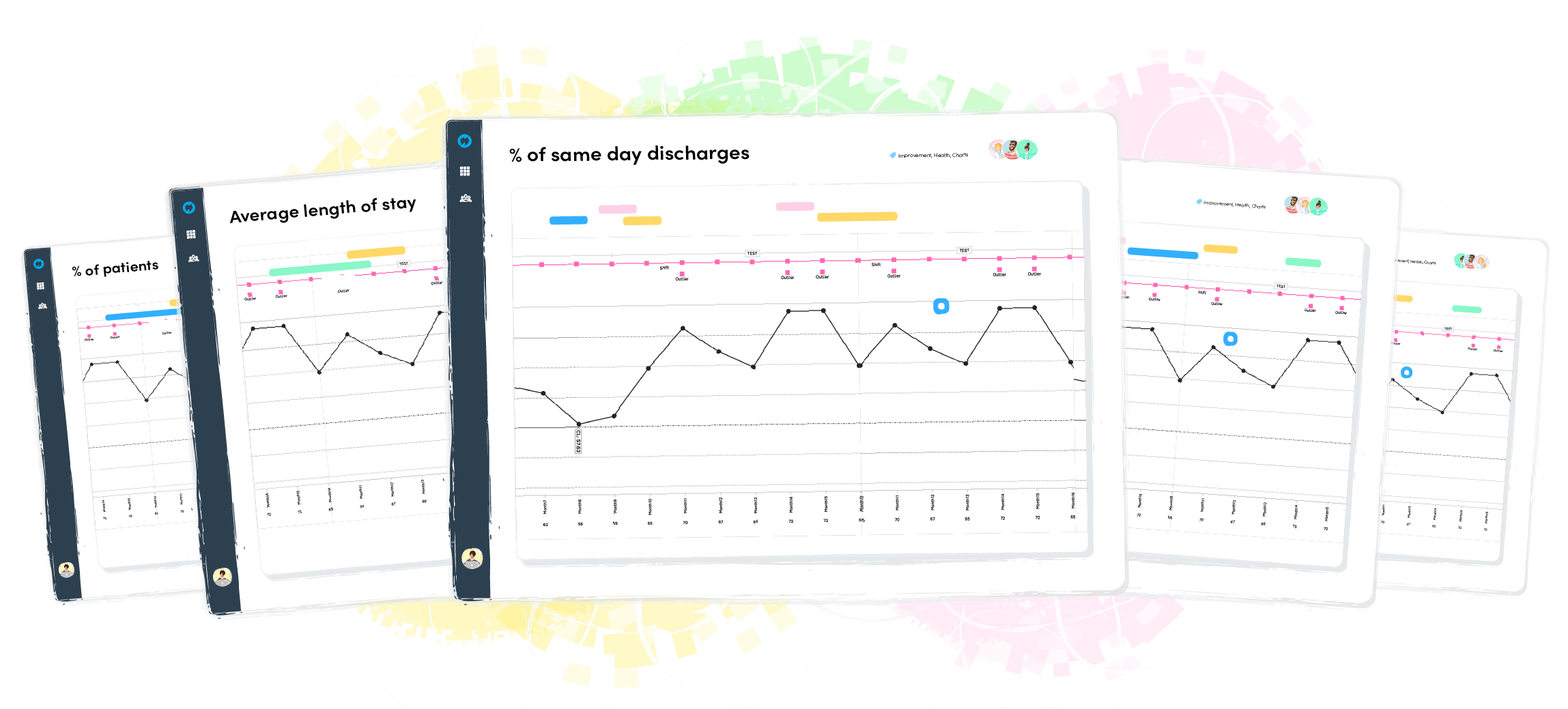
Thousands of organisations create their SPC charts in Life QI


Visualise the impact
Build SPC charts to visualise your data and display the results of your changes. Bring together your data from multiple sources and watch it aggregate automatically.
Auto-calculate and Detect
Simplify statistical charting and analysis. Life QI’s SPC charts automatically calculating the control limits for your data, allowing you to easily see how stable the process is and where the problem areas are. Gain rich insights that inform your improvement.
Identify Special Cause Variation
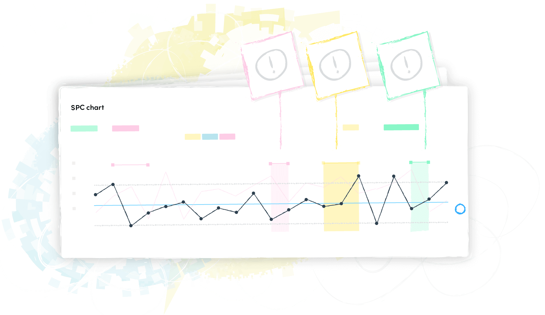
Life QI SPC charts automatically detect and visualise any special cause variation (SCV) in your data. No need to remember or implement the SCV rules manually - Life QI has you covered. Allowing you to easily monitor where your changes are causing significant variations to the process you are monitoring. Giving you statistical proof you are improving!
Outlier
Shift
Trend
High Variation
Low Variation
Annotate Key Events
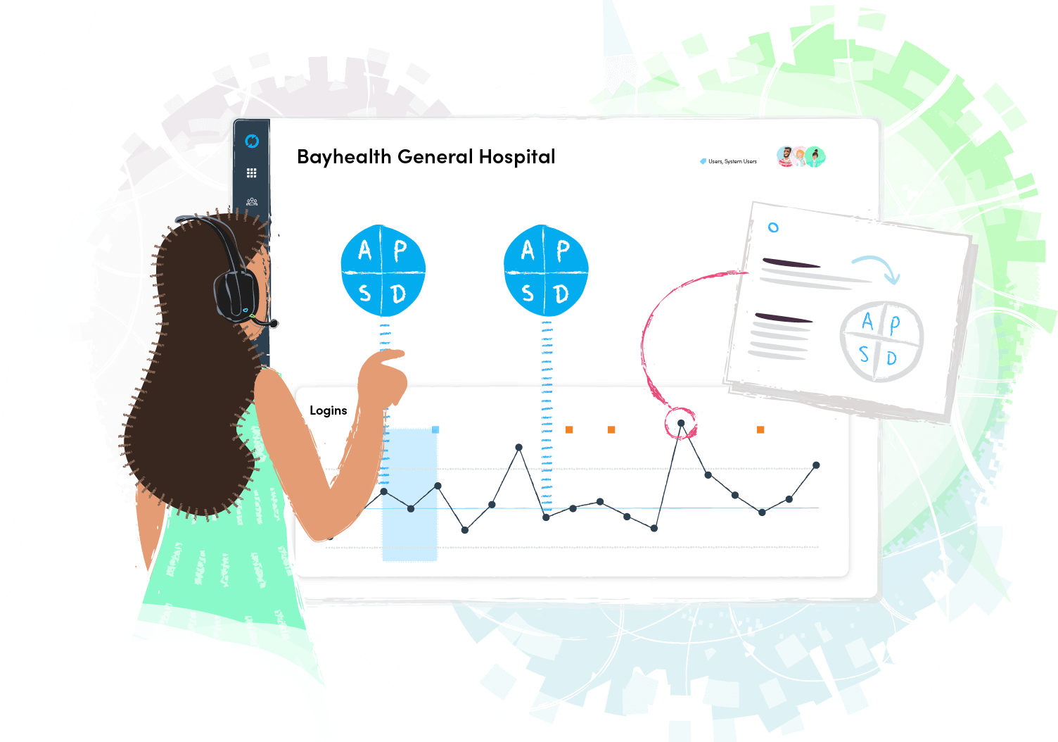
Track all your changes in one place. By visualising your PDSA cycles on your charts and adding notes you can annotate key events, allowing colleagues to understand and interpret your work with ease.
Export
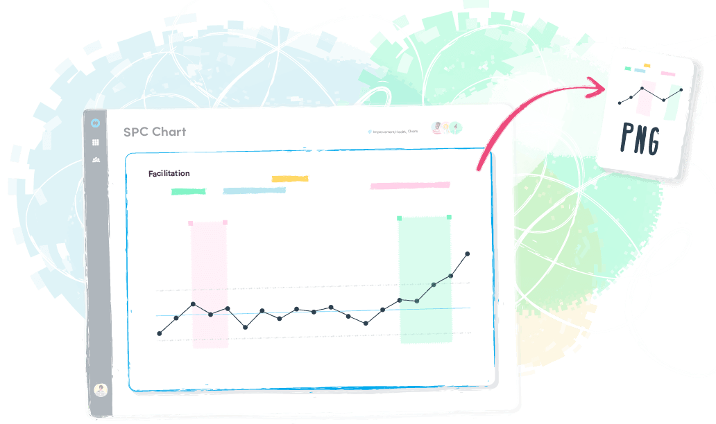
Sometimes it can be useful to export your SPC charts to facilitate discussing it during a team meeting, including it in your presentation or simply printing it. Life QI allows you to export and download your run and control charts as an image file to be shared with your colleagues or imported into other software.

Use SPC Charts to:
| • | Measure the impact of your changes |
| • | Predict the expected outcomes of improvements |
| • | Monitor the processes to see if they are under control |
| • | Analyse the cause of the variations |
SPC Charts in Life QI
Run Chart
Used with almost any process and with any type of data: measurements, counts, percentages, ratios, etc. but don’t provide the same depth of analysis as a control chart.
I-Chart
This type of cotrol chart is used for variable (continuous) data (e.g. time, money, height/weight, temperature, etc.) or to record measures for each observed unit.
C-Chart
Used to display counts of things we are trying to avoid happening, (e.g. number of violence incidents, number of falls, etc.) where a fixed sample size exists.
U-Chart
An attributes control chart used to display counts for an inconsistent sample size or "area of opportunity", where the number of patients on the wards varies considerably.
P-Chart
It displays proportions or percentages for an equal or unequal sample size and is used when the data is based on two classifications (e.g. Yes/No, Pass/Fail, etc.)
T-Chart
Used when the error or undesired incident occurs infrequently in a particular setting (e.g. incidents of physical violence on wards, or incidents of falls).
G-Chart
Geometric Chart is used when the error or undesired incident occurs infrequently in a particular setting (e.g. medication error, or incidents of MRSA on a ward).
X-Bar/S Chart
Used to chart data that is measured and comprised of multiple sub-groups and you have breakdowns of this data, useful when the sample size is relatively large and variable.
Measure all your improvement efforts in one place
Related Improvement Tools
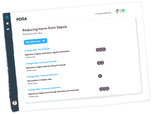
PDSA cycle
Plan and test your changes with PDSA cycles. This 'trial-and-learning' method allows you to develop a plan what change is going to be made, carry out the change, observe and learn from the consequences.
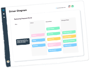
Driver Diagram
Structure your thinking about how you can improve the quality of care. A driver diagram connects your aim with primary and secondary drivers and includes ideas to make the improvement happen.

